Typographic Poster
Typefaces
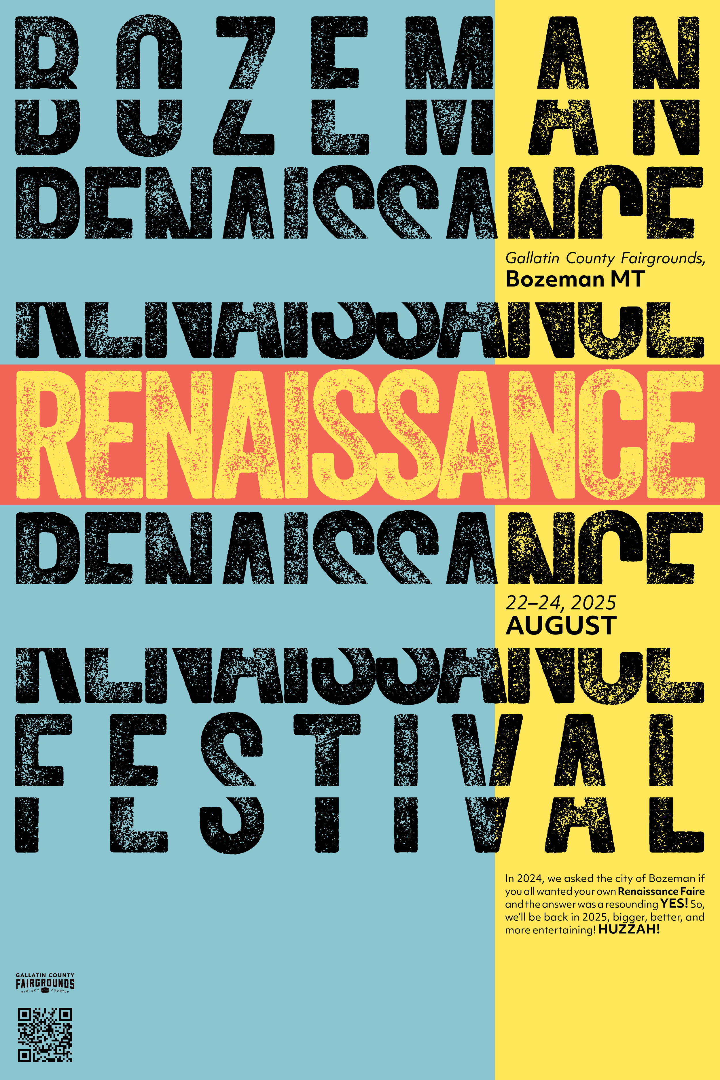
Veneer
Objective MK1 Deva
Class
GDSN 223 with Ashley Fuchs // Fall 2024
This type focused poster captures the essence of the Bozeman Renaissance Festival while also clearly communicating what, when, and where the event is. To accomplish this the poster was heavily iterated on with the defining terms in mind: creative, mystical, medieval, light hearted, and cultural. The creative and cultural natures of the event are captured in the typefaces. The title typeface “Veneer” is used because of its likeness to hand made craft, such as those that would appear at the festival. The body typeface “Objektiv” is meant to subtly bring in a cultural feel with its unique qualities, but admittedly it may be a little too subtle. Mystical is highlighted in the repeated type manipulation of “Renaissance.” The undulating series of breaking up the word brings a sort of magical mystery to the piece. Medieval is captured by the use of the primary colors, which echoes ancient tapestries where blue, yellow, and red were commonly used. Light hearted is brought out by the hierarchy in the body text. Moments where the organizers are having fun with their communication are purposely brought out to show the joyous nature in the festival. Overall, each moment of this piece was extensively thought out and specifically placed through the use of an extensive iterative process.